The minimalist movement has convinced us that the only path to visual peace is ruthless purging. But research from the Princeton University Neuroscience Institute reveals a more nuanced truth: visual clutter competes for your cognitive attention, but “clutter” is defined by visual noise, not item count. A room with 50 objects can feel serene while another with 15 feels chaotic. The difference? How those objects are contained, colored, and perceived.
The revolutionary insight is this: you don’t need to own less to see less. You need to see less to feel calm. This distinction opens up a world of optical illusions, visual boundaries, and psychological tricks that create the sensation of spaciousness while preserving everything you own. It’s not about denying your relationship with your belongings—it’s about curating how you experience them.
The Visual Perception Paradox: Why Clutter Is in Your Eyes, Not Your Space
Our brains process visual information through pattern recognition. When objects appear scattered, overlapping, or without clear boundaries, our threat-detection circuits activate, creating low-level stress. This is why a desk with papers strewn everywhere feels overwhelming, but the same desk with papers stacked in three neat piles feels manageable—even though the item count is identical.
A 2023 study published in the Journal of Environmental Psychology found that participants in visually cluttered rooms showed a 27% increase in cortisol levels compared to those in visually organized spaces with the same number of objects. The critical variable wasn’t quantity—it was visual grouping. Objects contained within clear boundaries (trays, baskets, shelves) registered as a single visual unit, while scattered objects registered as individual threats to process.
This means your collection of 20 perfumes doesn’t have to be decluttered—it needs to be contained. Your stack of unread books doesn’t need to be halved—it needs breathing room and alignment. The goal isn’t minimalism; it’s visual order that whispers instead of shouting.
The Visual Noise Scale
High Noise (Stressful): Objects scattered, overlapping, multiple colors/textures competing, no clear edges or boundaries
Medium Noise (Neutral): Objects grouped but exposed, some color coordination, occasional overlaps, defined zones
Low Noise (Calming): Objects contained, uniform colors/textures, clear space between groups, visual breathing room
The Container Revolution: Creating Visual Boundaries That Calm
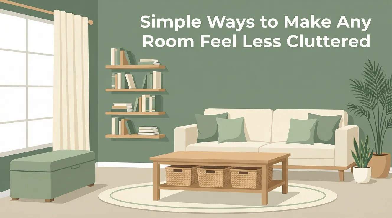
Containers are the ultimate visual hack. They transform scattered individual items into a single, contained unit that your brain processes as one object. A coffee table covered in remote controls, magazines, pens, and coasters becomes instantly serene when those items live inside a tray. The tray creates a hard boundary that says “this is intentional,” not “this is chaos.”
The key is choosing containers that match your décor. A rustic wood tray on a modern glass table creates visual contrast that draws attention (bad). A matte black tray on black metal legs disappears into the background, letting the contained objects read as a curated vignette rather than clutter. Storage baskets and containers succeed not just because they hide things, but because they create visual order through uniformity.
The Rule of Uniformity
A bookshelf with books arranged by height and color feels organized even if every shelf is full. The same bookshelf with books haphazardly crammed in every direction feels cluttered. The difference is visual rhythm. Your brain processes patterns as safe and predictable. Randomness triggers alertness and stress.
Apply this principle everywhere: Store pantry items in clear, identical jars. Keep cleaning supplies in统一的caddies. Corral bathroom products in matching baskets. The containers don’t need to be expensive—three $5 white plastic bins from the dollar store create more visual calm than one $50 artisanal basket surrounded by loose items.
The Container Hierarchy
Fine-Grain: Drawer dividers for utensils, desk organizers for pens, spice jars for pantry
Medium-Grain: Baskets for throw blankets, trays for coffee table items, bins for closet shelves
Large-Grain: Ottoman for spare linens, lidded bench for shoes, armoire for media equipment
Color Psychology: Painting Your Way to Perceived Order
Color influences clutter perception more than any other factor. A monochromatic palette—variations of one color—creates visual continuity that makes disparate objects feel related. Your eye flows smoothly across the space instead of jolting at every color change. This is why Scandinavian design feels so calm: it’s built on a foundation of whites, grays, and natural wood, not because it’s minimal, but because it’s chromatically unified.
If you can’t repaint your rental, apply this principle to what you own. Choose three colors and commit to them for all visible items. In your living room, maybe it’s white, charcoal, and sage green. Every throw pillow, blanket, and decorative object adheres to this scheme. Suddenly, the 30 objects in the room feel like part of a curated collection, not visual noise. The psychology of color in stress reduction shows that cool tones (blues, greens, grays) literally lower heart rate, while warm tones (reds, oranges) raise alertness and anxiety.
The 60-30-10 Rule for Clutter Camouflage
Interior designers use the 60-30-10 rule: 60% dominant color, 30% secondary, 10% accent. Apply this to your belongings. If your room is 60% white (walls, large furniture), make your storage containers 30% gray (medium tone) and your decorative objects 10% black (accent). The eye naturally categorizes this as “designed” rather than “cluttered.” A bookshelf arranged with 60% books spine-out (dominant), 30% storage boxes (secondary), and 10% small objects (accent) feels intentional, not overwhelming.
Lighting as a Clutter Eraser: How Shadows Create Visual Noise
Bad lighting creates shadows, and shadows are visual clutter. A single overhead fixture casts harsh shadows that make objects look jumbled and chaotic. Layered lighting—ambient, task, and accent—creates even illumination that flattens visual noise and makes spaces feel orderly. Under-cabinet lighting in the kitchen eliminates the cavernous shadows that make countertops feel cluttered even when clean.
The color temperature of light matters enormously. Bulbs rated 2700-3000K emit warm, amber light that softens edges and creates a cozy atmosphere. Cool white bulbs (4000K+) create stark contrasts that highlight every object and imperfection. Swap your kitchen bulbs to warm white and watch the visual tension drop. Architectural Digest’s lighting guide emphasizes that the right bulb can make a room feel 30% more organized without moving a single object.
Directional Light for Focus Control
Use directional lighting to literally point attention where you want it. A picture light over a bookshelf makes the books look like a curated display, not clutter. A pendant over a dining table creates a focal island that makes the rest of the room fade into background. Uplighting in a corner plants draws the eye up, making the ceiling feel higher and the room more spacious. You’re not hiding clutter—you’re redirecting attention away from it.
The Art of Curated Display: Turning Clutter Into Collections
What separates a “collection” from “clutter”? Spacing and intentionality. The same 15 objects arranged with breathing room and alignment feel like a museum display. Crammed together with no negative space, they feel like junk. The magic is in the margins.
Apply the “gallery rule”: treat every surface like a museum gallery. Each object needs at least 2 inches of empty space around it. On a bookshelf, this means not pushing books flush against each other but leaving a finger-width gap. On a mantel, it means placing objects at varying heights with space between them. A HouseLogic guide to reducing clutter emphasizes that “clutter may be stressing you out even more than you realize,” but notes visibility control is often more effective than removal.
The Rule of Threes and Odds
Group objects in odd numbers—three or five. Our brains find odd-numbered groupings more dynamic and intentional than even-numbered pairs. Three vases of varying heights on a windowsill feel curated. Four vases feel like you just lined them up. The same principle applies to wall art: a cluster of three frames feels like a designed moment; two frames feel like you haven’t finished decorating.
Furniture Placement Tricks: Creating Sight Lines That Flow
How furniture directs the eye determines whether a room feels cluttered or calm. A room where your gaze stops at every piece of furniture feels choppy and full. A room where your eye flows along continuous lines feels spacious, even if it contains the same number of objects. The key is creating “sight highways”—unbroken visual paths that guide the eye smoothly through the space.
Position your largest furniture pieces at right angles to the main entrance. This creates a welcoming corner that frames the room rather than blocking it. A sofa placed perpendicular to the door invites you in; a sofa placed directly facing the door creates a visual barrier that makes the room feel smaller and more cluttered. The best small living room ideas emphasize that layout, not size, determines how spacious a room feels.
The Floating Furniture Illusion
Pull furniture away from walls, even by just 2-3 inches. This creates negative space that suggests breathability. A bookshelf that floats slightly off the wall feels lighter and less imposing than one shoved flush. A console table behind a sofa with space between them creates a “floating” effect that makes both pieces feel less bulky. This is counterintuitive—shouldn’t you maximize every inch in a small space? But visual breathing room always trumps physical efficiency for perceived calm.
Textile Tactics: How Patterns and Texture Affect Clutter Perception
Pattern is visual complexity. A patterned rug, busy curtains, and a printed sofa in the same room create three competing visual fields that make the space feel cluttered regardless of how tidy it is. The solution isn’t to eliminate pattern but to ration it. Choose one statement pattern—a rug, a single accent chair—and keep everything else solid in complementary tones. This creates a focal point that organizes the visual field rather than fragmenting it.
Texture, however, can reduce visual clutter. A chunky knit throw on a smooth leather sofa adds depth without noise. A sisal rug under a sleek coffee table grounds the space. The interplay of textures creates interest that replaces the need for multiple patterns. Good Housekeeping’s clutter reduction guide notes that texture variation creates “visual depth that makes rooms feel layered, not loud.”
The Solid Color Strategy
If your room feels visually chaotic, remove patterned textiles for two weeks. Solid color curtains, a plain rug, and neutral pillows create a baseline of calm. You can always add pattern back in one piece at a time, but you’ll likely find you don’t miss it. The visual quiet becomes addictive.
Digital Decluttering: Reducing the Visual Noise You Can’t Touch
In modern rooms, digital devices are major clutter contributors. Tangled cables, flashing LED indicators, and screens that glow even when “off” add visual noise that traditional organizing can’t address. The solution is concealment through design.
Use cable management boxes (or even decorative boxes with holes cut in the back) to hide power strips and bulky cords. Paint them the wall color for near-invisibility. Turn devices so screens face the wall when not in use—your TV’s blank screen is a black rectangle that adds visual weight, but its back is neutral gray. Cover small LED lights with black electrical tape; those tiny pinpricks of light create visual “static” that undermines calm, especially at night. An organized approach to digital clutter can reduce visual noise by 40% without removing any devices.
The Wi-Fi Router Rule
That blinking router isn’t just ugly—it’s a micro distraction. Place it inside a ventilated basket or behind a plant. The basket contains the visual chaos; the plant adds a living element that reduces stress. Just ensure at least 50% airflow to prevent overheating.
Practical Strategies: Your No-Purge Calm Room Blueprint
The Container Blitz (Week 1)
Buy 5-7 containers that match your décor. Start with your biggest visual pain point—probably the coffee table or kitchen counter. Place everything from that surface into the container. Suddenly, it’s not clutter; it’s a curated group. The container is now the bad guy, not you. When it’s full, you must remove something to add something else.
The Monochromatic Edit (Week 2)
Choose three colors from your existing décor. Remove or hide anything that doesn’t match. This isn’t permanent—you’re just experimenting. Put the “off-color” items in a closet for two weeks. Notice how the room feels. You’ll likely realize you don’t miss the visual chaos.
The Lighting Layer (Week 3)
Add one new light source to your worst-lit room. A $20 floor lamp in a dark corner, a $15 stick-on LED strip under kitchen cabinets, or a $10 plug-in nightlight in a hallway. Notice how shadows created visual noise you didn’t even register until they were gone.
The Breathing Room Test (Week 4)
Move one piece of furniture 3 inches away from the wall. Create one “gallery” arrangement on a surface by spacing objects with 2-inch gaps. Add one plant to a cluttered area—plants somehow make surrounding clutter feel more intentional. Live with these small changes for a week. The cumulative effect will surprise you.
Your Clutter Relief Doesn’t Require a Purge
The calm, spacious room you want isn’t on the other side of a massive decluttering project. It’s on the other side of seeing differently. Containers, color, lighting, and spacing are your tools for transforming perception without sacrificing possessions. You can love your things and love your space—they’re not mutually exclusive.
Start with one container. Add one lamp. Pull one piece of furniture away from the wall. These tiny shifts create a ripple effect that changes how you experience your entire home. The clutter isn’t in your things—it’s in how they’re seen. And how they’re seen is entirely within your control.
Your room can feel like a sanctuary and house everything you love. The secret is that it’s not about having less. It’s about seeing less noise and more intention.
Key Takeaways
Visual clutter is defined by perception, not possession count—containers, color schemes, and lighting create the sensation of order more than minimalism does.
Uniform containers transform scattered items into single visual units, reducing cognitive load and creating intentional-looking groupings.
Monochromatic color palettes and strategic lighting choices can make rooms feel 30% more organized without removing any objects.
Spacing objects with breathing room and applying the “gallery rule” (2-inch gaps) turns collections into curated displays rather than clutter.
A four-week blueprint of small changes—containers, color editing, lighting, and spacing—can transform a room’s feel without any purging.
“`
Leave a Reply